Today we started the class by working on our zines. We showed our character design to Ma’am and she told us to use Illustrator and image trace our drawings and convert them into vectors for our zines.

We showed our zine ideas to ma’am and how we wanted the layout of the zine. Ma’am then told us how to print the pages according to us for the zines. We started making corrections in our zines and then put them in illustrator to make them vectors and try a few colour gradients and options.
Ma’am then taught us a few options in photoshop. Ma’am taught us different options(Brightness/Contrast, Hue/Saturation) in the image menu used to enhance pictures.
1. Open a picture
2. Click on Image – Adjustment – Brightness/Contrast
3. Enhance the picture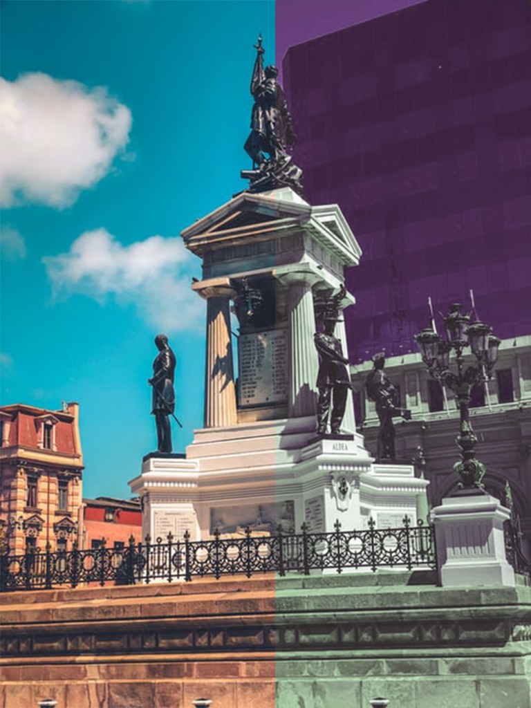
1. Open a picture
2. Click on Image – Adjustment – Hue/Saturation
3. Enhance the picture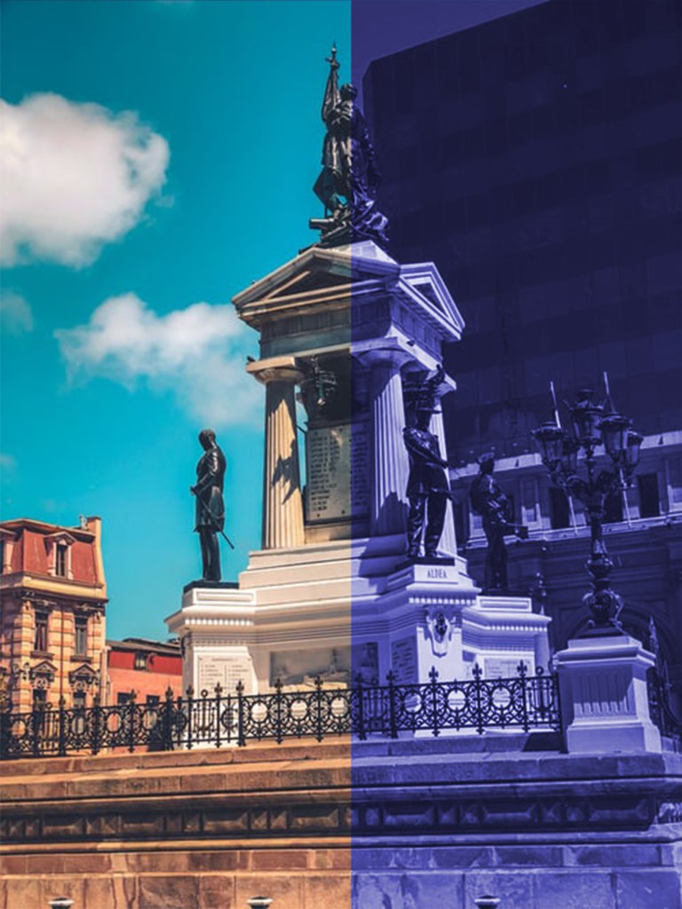
1. Open a picture
2. Click on Image – Adjustment – Hue/Saturation
3. Choose the Colorize option
4. Enhance the picture

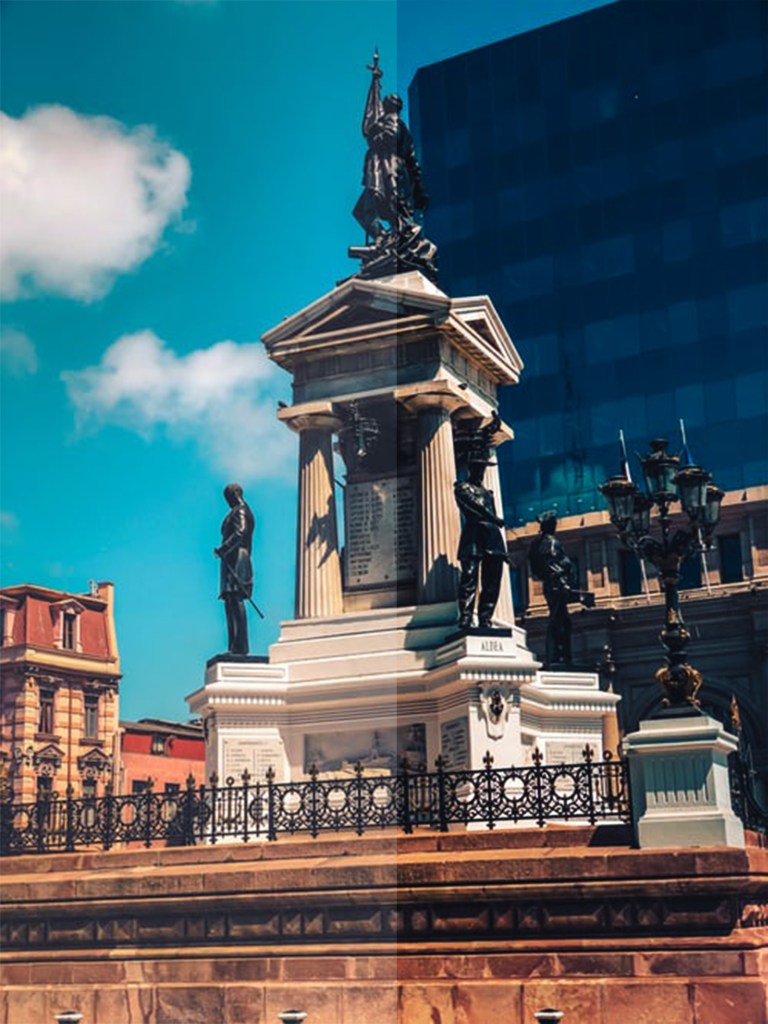
Normal Picture 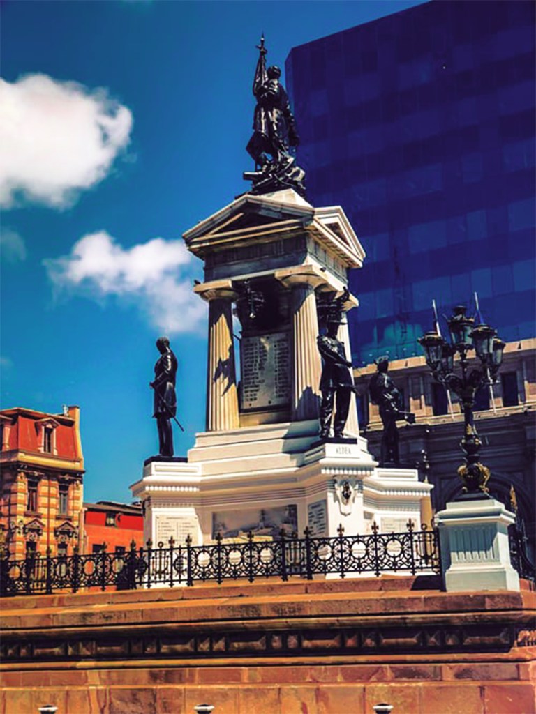
Picture enhancement using Selective Option 
Selective Option can also be used within objects
Ma’am then taught us how to use Styles. Styles are basically ready-made effects which can be applied to Texts or Objects.


2. Create an Object/Text
3. Choose the style
Ma’am taught us to apply perspective on Texts. First of all, we need to convert the Text into an object and to do so we simply Rasterise the Layer. Then go on Edit – Transform – Perspective and move the cursor accordingly. Ma’am made multiple copies of a text in perspective which gave it a nice effect, to do so click Ctrl + Shift + Alt + Up/Down arrow.

